The confusing chart dilemma
Imagine this: you’ve spent hours preparing a report, meticulously analyzing data, and carefully crafting your presentation slides. The moment arrives, and you confidently display your first chart on the screen. But instead of nods of understanding, you’re met with furrowed brows and confused stares.
Your audience squints at the screen, trying to decipher the numbers and lines. Some lean forward in concentration, while others glance at their colleagues, silently asking, “Do you understand this?” You begin explaining, but the confusion persists.

Or perhaps you’ve been on the other side—receiving a slide deck with complex data visualizations but no clear explanation. The title seems promising, but as you scroll through, you’re bombarded with numbers, charts, and minimal text. You struggle to grasp the key message, wishing you had telepathic powers to understand what the presenter intended.
These situations are all too common. But the good news? They can be avoided. By applying a few essential principles, you can ensure your charts are clear, insightful, and engaging.
Recommended for you: Why Numbers Alone Aren’t Enough
The 9 essential elements of an effective chart
After years of working with data visualization and presentation slides, I’ve found that truly effective charts share nine essential elements. Here’s what you need to include:
1. A clear and concise title
Your chart must have a title that tells the audience exactly what they’re looking at. Instead of a vague heading like “Sales Data,” opt for something more informative, such as “Quarterly Sales Growth in 2024.” Adding a time frame helps provide context and clarity.
2. Time period indicated
Always specify the period covered by the data. You can include this in the title, axis labels, or footnotes. For instance, “Revenue Trends (Jan–Dec 2024)” immediately informs the audience about the timeline.
3. Clearly defined units
Numbers without units are meaningless. Whether it’s percentage, kilograms, dollars, or subscribers, always specify what the numbers represent. If the figures are in millions, simplify them (e.g., instead of writing $1,200,000, display $1.2M and clarify in the unit label).
4. Brief explanatory text (if needed)
While not always necessary, adding a short explanation can enhance understanding. A maximum of three sentences can highlight key insights, such as, “Sales peaked in Q3 before declining in Q4 due to seasonal factors.”
5. The right chart type
Choosing the appropriate chart type is crucial. Line charts work well for trends over time, while bar charts are great for comparisons. If necessary, add data labels to make individual values easier to read.
6. Well-labeled tables
If your data is presented in a table, ensure column headings are clear and include units where applicable. A well-structured table makes information easier to digest.

7. Data source attribution
Citing data sources enhances credibility. Always include a source note at the bottom, such as “Source: World Bank, 2024” or “Source: Internal Survey, May 2024.” If the data has been processed or modified, clarify that (e.g., “Source: BPS, processed by XYZ Research”).
8. Additional notes for clarity
If there are important caveats, include them in a footnote. For example, “Data for December is preliminary and subject to revision.” This prevents misinterpretation and builds trust with your audience.
9. Consistent and thoughtful use of colors
Colors play a major role in making charts visually appealing. Use a consistent color scheme that aligns with your brand or theme. Avoid excessive colors, as they can be distracting. Ensure the same colors are used for similar categories across slides to maintain coherence.
 The power of well-designed charts
A well-crafted chart doesn’t just display numbers—it tells a story. When your charts are clear and insightful, they help your audience grasp key points quickly and make informed decisions.
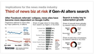
Many professionals excel at presenting data in a way that is both simple and impactful. One example is Greg Piechota, a researcher from the International News Media Association (INMA). His presentations are clean, well-structured, and full of meaningful insights—proving that simplicity often leads to greater understanding.
By applying these nine keys, you can transform your charts from confusing visuals into powerful storytelling tools. No more lost audiences, no more frustrating presentations—just clear, compelling insights that drive action.
Now, it’s your turn. Try implementing these principles in your next presentation, and watch how much more engaged your audience becomes!
Explore more presentation tips on another page: 10 Data Presentation Tips.
Share this content: