Imagine reading a news story about the growing threat of heart disease in Indonesia. Instead of being overwhelmed by fear or dry statistics, you’re presented with an interactive infographic showing a decade long rise in cases, a map of high-risk areas, the economic toll reaching trillions of rupiah, and real stories of people fighting the disease.
This is the essence of data journalism, transforming raw data into compelling narratives that resonate with readers, including those without a technical background.
What is data journalism?
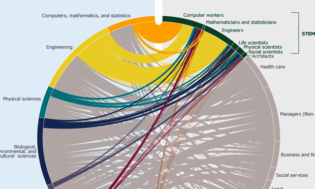
Data journalism is a form of journalism that combines data collection, analysis, and visualization to present information in a meaningful and engaging way. The goal is not just to show numbers, but to tell the story behind the data, making complex issues easier to grasp for readers from all walks of life.
Why is data journalism important?
In today’s information-saturated world, raw data without proper context can be confusing, or worse, misleading. Data journalism bridges that gap by turning data into clear, accurate, and accessible insights for the public.
Here’s what data journalists do:
- Uncover hidden truths: By analyzing datasets, journalists can find stories that traditional reporting might miss.
- Simplify complex information: Data visualizations break down complicated topics, making them digestible and memorable.
- Boost credibility: Transparent use of data builds trust with readers. As Dan Heath, bestselling author, once said:
“Data are just summaries of thousands of stories—tell a few of those stories to help make the data meaningful.”
Not just for heavy topics
One of the great things about data journalism is its flexibility. It’s not limited to weighty, complex issues, it can also bring depth and insight to lighter, lifestyle-driven topics.
These are some examples:
A serious topic:
In Kompas Daily ’ article “The Economic Burden of Heart Disease: Rp 67.34 Trillion”, journalists analyzed health insurance claims and productivity loss to estimate the national economic impact of heart disease. Their findings projected a staggering Rp 67.34 trillion burden by 2024.
Find the complete article here: Heart Disease’s Economic Toll Reaches Rp 67.34 Trillion
A lighter topic:
In “Searching for Indonesia’s Best City for Slow Living”, the Kompas data journalism team examined indicators such as cost of living, safety, and infrastructure to identify the most relaxing cities to live or retire in. This relatable, data-backed piece tapped into the rising interest in the “slow living” trend.
Dive deeper into the topic here: Kedu Raya: A Top Destination for Slow and Peaceful Living
How to start: 4 simple steps
Interested in creating your own data-driven stories? Here’s how to begin:
- Learn the basics of data analysis. Start with tools like Excel, Google Sheets, or databases. Understanding how to manage and interpret data is foundational
- Master data visualization. Use tools like Flourish, Datawrapper, or Tableau to craft clear and engaging visuals.
- Build strong storytelling skills. Even great data needs a good story. Practice writing narratives that connect emotionally with readers.
- Stay skeptical, verify everything. Always cross-check data sources and ensure accuracy before publishing. The goal is to inform, not impress.
The bottom line
Data journalism is the perfect blend of storytelling and science. By combining narrative with numbers, journalists and data analysts can deliver content that’s not only informative but also compelling and trustworthy.
In the digital age, the ability to communicate complex data effectively is more valuable than ever. As readers, understanding data journalism helps us consume information more critically, and appreciate the thoughtful work behind each story.
What about you?
Have you ever found a data visualization that helped you understand an issue better? Or maybe you’re curious about creating your own data-driven story? Share your thoughts or questions in the comments. Let’s talk!
Enjoyed this? Don’t miss my other articles: Why Numbers Alone Aren’t Enough
Share this content: