Avoid data visualizations that confuse your audience
Have you ever had an important dataset that no one seemed interested in? Instead of engaging with it, your audience frowned, got overwhelmed, and left the page. Sounds frustrating, right?
The truth is, a poorly designed visualization can do more harm than good. Simply throwing numbers onto a chart without thought can make your data unappealing and difficult to understand. And that’s a shame, because often, data is the heart of a story.

Especially in data journalism, where the analysis and interpretation of numbers shape the entire narrative, effective visualizations are essential. The right tools can help transform complex information into something clear, engaging, and actionable.
Flourish studio is a powerful solution
Fortunately, there are several platforms available today that make data visualization more accessible—ranging from static charts to interactive graphics. These platforms require no programming skills; just upload your data, tweak some settings, and you’re good to go.
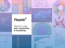
One standout tool is Flourish Studio (https://flourish.studio/). This platform claims to “turn data into stunning interactive tables, maps, and storytelling visuals.” Major international media outlets like BBC and The Guardian use Flourish, and some digital media companies in Indonesia have also adopted it.
Three reasons to love flourish studio
Having used Flourish multiple times, I can say it truly lives up to its promise. Here are three key reasons why Flourish is a game-changer for data visualization:
- A wide range of templates . Flourish offers a variety of pre-designed templates with ready-to-use examples, making it easier to choose the right style for your data.
- Easy embedding. The visualizations can be embedded seamlessly into content, whether as static images or interactive elements.
- Storytelling feature . The built-in ‘Story’ function allows users to create data-driven narratives, guiding readers through complex information step by step.
- Free to use. While there are premium options, the free version provides plenty of powerful features, making it an excellent choice for budget-conscious creators.
Explore more: Too Much Data? Build a Composite Index!
An example of a stunning flourish chart
Let’s take a look at a practical example. Below is a Flourish-generated chart that visualizes how Indonesians utilize telemedicine services—a trend that surged during the COVID-19 pandemic.
The graphic represents the percentage of telemedicine users by province using a bubble chart. Larger bubbles indicate higher usage rates. Not only does this format make the data visually appealing, but it also helps users quickly grasp the key insights.
Moreover, Flourish allows for interactive filtering, enabling users to view data by different regions, such as islands or provinces. This interactive element makes the experience more engaging and user-friendly.
7 simple steps to create a stunning flourish chart
Want to create your own interactive visualization? Follow these steps:
- Visit https://app.flourish.studio/projects and log in (or sign up using your Google account).
- Once inside, click “New Visualization” on the top-left menu.
- Select a chart template that suits your data.
- Copy and paste your dataset into the “Data” tab next to the “Preview” panel.
- Adjust the column settings to match Flourish’s sample format.
- Check the Preview panel, fine-tune labels, colors, and other settings as needed.
- When ready, click “Export & Publish” to either download the visualization as an image or embed it into your website using a script, AMP, or iframe.
That’s it! Just seven simple steps to create an impactful data visualization. However, the real challenge lies in exploring Flourish’s various chart options and selecting the one that best fits your story.

Beyond charts: flourish’s storytelling feature
Flourish isn’t just about charts. It also offers a ‘Story’ feature, allowing you to combine multiple visualizations into a single, interactive narrative. This is particularly useful for guiding audiences through complex datasets with supporting text and insights. Stay tuned for a deep dive into this feature in another article!
Final thoughts
Data is powerful—but only when presented effectively. With Flourish, you can transform raw numbers into compelling, interactive stories that capture attention and drive understanding.
Give it a try and experience the ease of creating stunning data visualizations!
Read also: Pros and Cons of Flourish
Disclaimer: This article is not sponsored by Flourish Studio; it is merely a personal experience shared about data visualization.
Share this content: